Unfairness in the World

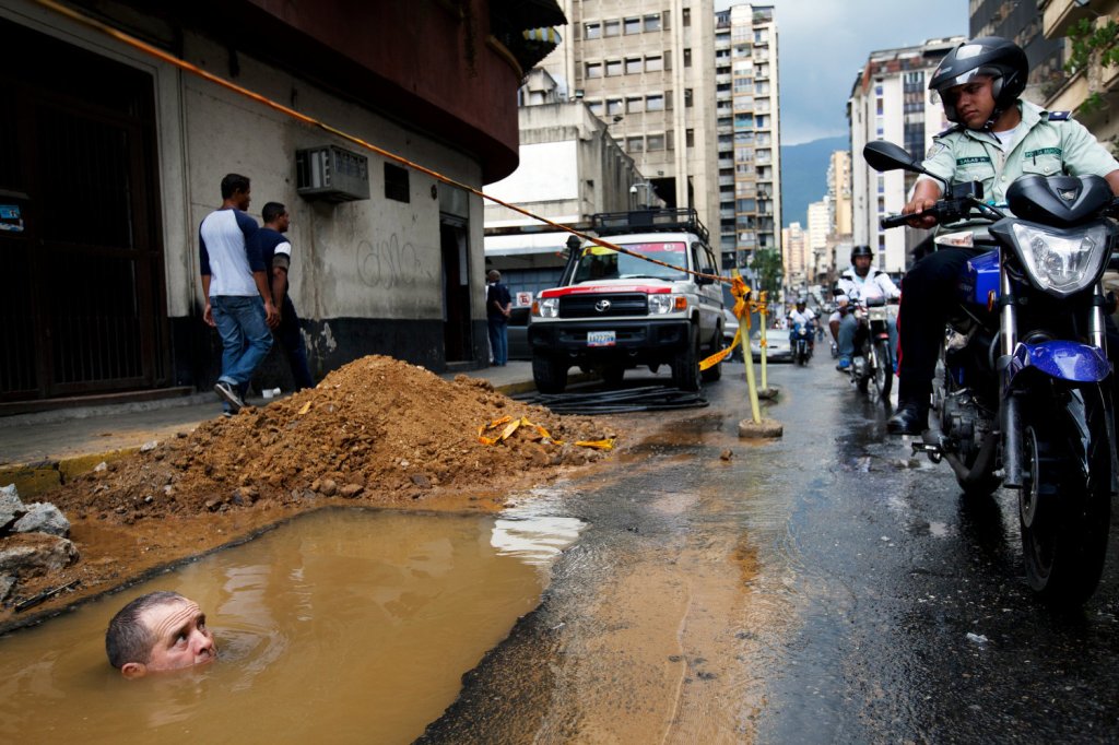
In today’s world, there are many stories of people being mistreated by police officers. High police force seems to be more prevalent in high-crime, low-income communities, and many people begin to question some of the uncalled for violence and intent of officers in those areas.

There are many different aspects of this image that catches the audience’s eye. For instance, it is noticeable that the infrastructure of the buildings is quite poor, with graffiti on some of the buildings, leading to the idea that this may be a low-income community. Also, what may lead the audience to believe that there is police officer unfairness in this community, is that there is a man submerged in a water-filled hole, and an officer is only looking down upon him, and not lending a helping hand. Furthermore, one can tell from the facial expression on the man in the waters face, that he is terrified. Whereas, the police officer is showing no emotion, and has a very stern face. Also, there are two men walking by the scene in the background of the image, and seem to be ignoring the situation. They may be ignoring the situation either because they are desensitized to it, since this behavior happens frequently, or they may not want to get involved because they don’t want any actions taken against them.

There are also several smaller details that seem to symbolize different aspects of the issue. For example, the sky looks dark and gloomy, which could be referencing the awful problem going on in this picture and society. Also, further in the background of this image is a man who is facing the wall, with his back turned to the scene. This could be inferring that some people turn their backs to these types of situations completely, ignoring the problem. Also, the rope that is in front of the man who is submerged in the water-filled hole, could symbolize the fact that there could be a dangerous situation in that area. The dangerous situation could be the fact that the man in the hole may be ignored by the police officer and not brought to proper safety with respect.

The overall story I feel the image is trying to relay to the audience, is pertaining to some of the wrongdoings done by the police force. The idea that the police officer is looking down upon the man, and not helping, could be referencing an abuse of power. Also, the man in the water, looks extremely worried and scared, while looking up at the officer. Also, there is a line of people behind this police officer. We, as an audience cannot be one-hundred percent sure if anyone stops to help this man, but from what is being perceived from this image, it is likely to assume that no one will lend a helping hand.

I believe the target audience are those that are either targeted themselves with these issues of police unfairness, or those that need to be educated about these issues in today’s world. This is definitely an issue in today’s world, so it is pertinent that in order to change this issue, everyone is aware of what is happening.

“RISE UP” – Olympics

I am choosing the video “Andra Day’s “Rise Up” (footage from 2012 London Olympics). This video showed me how proud I should be to be an American. It doesn’t matter what race, gender, or sexuality. We cheer each other on until the end. We accept defeat, and strive to be our best and support one another. We do this because we know those other countries are trying just as hard as we are to bring pride towards their countries. 

Those Olympians are told that they’d never become champions, yet they became legends. This comes to show that just like in Andra Day’s song “rise up” if one has the ability to “rise up” above their obstacles, then anything they wish to achieve is possible. The songs starts out by saying, “You’re broken down and tired of living life on a merry-go-round and you can’t find the fighter but I see it in you so we gonna walk it out and move mountains we gonna walk it out and move mountains” I feel as though Andra is trying to portray how nothing is moving forward in life and everything seems repetitive and nothing is being achieved but Andra sees the light. In the beginning of the video it starts by showing Team USA’s Olympic training warehouse. Then it shows each team is trying their hardest to train to become the best they can in what they do in each sport.


As a dancer myself I was especially drawn to the women’s gymnastics team as their routines and movements are somewhat related to my own. I can still remember McKayla Maroney’s “perfect” vault in the 2012 London Olympics all around team final. In the video they show her performance on the vault while Andra is singing her vocals and she definitely rose up and defeated it. You can hear the announcer say “The fab 5 is going gold.” Probably one of the greatest feelings in the world for McKayla, the team, and the USA as a whole. 

In the bridge of the song Andra sings, “All we need, all we need is hope And for that we have each other And for that we have each other We will rise We will rise We’ll rise, ohh ohhh We’ll rise.” This shows as a team and country that we need each other and hope to make it out in the world. Without each other and hope it’s very hard to succeed and we won’t rise. We lift each other up with our positive comments and positive feedback. Through this we succeed. 

Another aspect of this video includes Serena Williams winning gold in singles tennis.  You can hear her say, “Wow, I have a gold medal in singles.” This might be one of the greatest accomplishments in the Olympics and she couldn’t have done that without her team, fans, family, and herself supporting her. You will never see someone smile as big as she did in that exact moment because of the training and hard work that she put herself through. 

In the video you can see each and every team holding american flags, waving and cheering each other on. The USA team doesn’t stop believing in themselves because they know they won’t let them stop until it’s over.  

Image Analysis

We live in a world full of advertisements that surround us all the time. Whether we are at the grocery store, walking through the streets of downtown or in a movie theater, advertisements can be identified all over the place. However, humans often choose not to pay attention to them despite all the effort that is put into creating them. Advertisements include so much detail so that many are gone unnoticed. The image I chose to analyze is an advertisement for Coca-Cola. This advertisement includes many details and small additions that enhance it and make it more persuading. It is clearly expressed that the creator of this advertisement put great time and consideration into it.

Pictured is a close-up view of a Coca-Cola bottle with a background of a grassy field and a small piece of a person cut out on the left corner. There is also a quote which states, “open a Coke, open happiness.” The intended audience could be anyone, although Coca-Cola probably is trying to target mostly young adults because they most likely drink Coke most often. In this ad, Coca-Cola is attempting to present to the audience that their product will make them happy and is an enjoyable drink. 

By presenting the Coca-Cola bottle up close they are explicitly showing the viewers what the main focus of the ad is. This grabs their attention first so then they can see all the other details surrounding it. The quote is placed to the right of the bottle which is strategic so that viewers will see it directly after they look at the bottle. The quote is directly stating their main goal of the ad, that Coke is a product that will make them happy which is why they should purchase it. 

There is also a background image of a green grassy field with the sun brightly shining down on it. The colors used to create this are very bright and pleasing to the eyes, which correlate with the positive feelings they want the viewers to experience when looking at the ad. The addition of a ladybug crawling on the grass adds to the summery, happy, and positive feeling as well. 

Finally, there is also a depiction of part of a human’s leg and arm in the lower-left corner of the image. Although not much of the body is shown, it is efficient as it shows the connection this product has to people. It shows the viewers that they too can have a refreshing Coke to drink on a hot summer day and increases their likelihood of purchasing the product. 

This advertisement for Coca-Cola is very persuasive and efficient in grabbing the viewer’s attention and showing them why their product is so great and will make them happy. Coca-Cola successfully implements small details to their advertisement to show the positive connection there is with their product which will persuade more viewers to purchase it.

Image Analysis

We first see here a beautiful sunset full or warm vivid colors. Right off the bat, setting a nice comforting vibe when looking at this image. Drawing from the “Parental Advisory Explicit Content” you see this is an album cover. “You should Be Here” by R&B female artist Kehlani. On the very cover of this album is Kehlani, in her authentic self with her tattoos and all. The songs on this album are very personal, just like the cover. Kehlani in raw form with her hair let loose and a pair of classic dirty high top vans tossed off to the side. This album is not a decorated version of herself, but her true self. The white T-shirt wearing Kehlani with not a care in the world except her music.

Here she is sitting on top of the world… (or a city in California hence the Golden Gate Bridge in the background) with nothing but her computer and a music recorder. Kehlani is the type of artist that takes pride in her music and wants to perfect her craft as much as possible. The album cover models this, as Kehlani is sitting on the roof top of this tall building with no distractions what so ever. Just staring off into the sunset, and letting the music flow right out of her. Kehlani’s raw talent is a reason why so many people listen to her songs; because, they are so relatable to the average person.

Kehlani could’ve easily chosen a glammed up album cover like other R&B artists, instead she chose a drawing of herself just facing the beautiful colorful sunset. Another factor in this image which I believe Kehlani did on purpose almost as a form of symbolism is: the fact she’s facing away on the album cover. You can’t see her face, the only thing that stand out besides the background is the fact that you can tell it’s her. With the hair color, and her exact tattoos she has on our body are detailed on the album cover.

Kehlani’s philosophy is she wants her music to matter more to people than what she looks like. Looking at this album you’re not listening to it simply because you see a pretty face, but for the zenful vibe the album cover gives off as soon as you look at it. Looking at this album cover I see a woman lost in reality, but lost in her music at the same time. Kehlani is watching the sunset go down, and planes go by as she’s coming in tune with her music and self. That album comforting album cover itself, makes me want to listen to this album. Album covers are a big factor when it comes to audiences who are actually going to listen to albums. By this album cover, those who don’t even know who Kehlani is are going to want to listen to it.When artists connect to their music by means of even an album cover they can connect with their listeners. Kehlani does an excellent job in executing her album cover as cover art, drawing in fans.

Image analysis of advertisement

The famous saying that a picture is worth a thousand words perfectly describes the profound advertisement made by World Vision, a humanitarian aid organization. This advertisement depicts a young white girl clothed in purple pajamas with blue polka dots, possibly around eight-years-old, reading a book in her perfectly arranged vibrant pink room. The floor is carpeted with a white rug, and there’s a pair of slippers as well as toys scattered in the room. The girl is sitting in her twin bed with an elegant white leather bed frame wrapped in a cozy pink blanket. The pink silk trim on the blanket runs feet back to a dark, uninsulated cement room with a young Indian girl, around the same age, sewing the trim. She is wearing a blue dress resembling a hospital gown with a long-sleeve patterned shirt underneath. The girl is at a table with a sewing machine with only one lamp towering over her providing her light to work. She is sitting on a cardboard box with fabrics on top in order for her to be able to reach the table. There is also another cardboard box covered with fabrics behind her. It the corner of this advertisement it says in all capital letters, “not every child gets a childhood.” This organization purposefully used a white girl to be the one in the room that bright and bubbly. The colors used to decorate the room greatly impact the image, pink is a comforting, warm color, and white is a pure innocent color. The combination of these two colors brightens the image, emphasizing the luxury and difference to the back of it. The back of the image, where the young girl is sewing, only has monotoned dark colors besides the pink tying the two separate situations together. The Indian girl is depicted in the background, symbolizing that she is not in anybody’s forethought. The fabrics are neutral colored, but appear to be dirty. The only light shining is a fluorescent desk lamp, the darkness of the room makes this advertisement even more powerful. The difference between the light of the two areas serves to create emotion from those who look at it. It shows the dark reality of how our products are made, at the hands of a child. The pink trim connecting the two girls, I believe, is meant to represent the connection between them. Regardless of race, different social and economic status, they are just two little girls. This organization is trying to bring light to the reality of what is going on in order for mass production to occur. Sadly in some countries, children are seen as adults and forced to go to work. They never have time to be a child, all due to the economic status they were born into. This organization wanted to show side by side, the reality behind how products are made to get an emotional response from their audience. In a society where capitalism runs the economy, products in stores are key to keeping the country going. Without realizing it, the country is run on the labor of children. It is not slavery, because they are getting paid. But it is pennies on the dollar. Nonetheless, it is no excuse for the children sacrificing their childhood for money.

Image Analysis Of Lebron James

The following image is of basketball player Lebron James, also commonly referred to as “King James.” He is currently on the Los Angeles Lakers in his 17thseason. If you are a hardcore or even a casual fan, you see how much Lebron has dominated from the moment he stepped on an NBA court when he was 18. This wallpaper shows Lebron sitting on a throne, trying to portray his dominance as an athlete. The colors used in this artwork are purple and yellowish gold. The background is set in a castle, which also shows some wires connecting to Lebron’s throne which lights it up. You could say Lebron has a serious and somewhat menacing look on his face. This sort of image gives me goosebumps, which I can’t really explain why. The target audience for this would be Lebron fans, Lakers fans, and sports fans in general. It is conveying his sense of dominance and how other NBA players respect him for all he has contributed to the game. The image is meant to act as a wallpaper for your phone, but I think it would also go well as a video game or magazine cover. Lebron is in full uniform in this artwork, while also holding a Los Angeles Lakers towel. This artwork was composed so Lebron and his throne were the center of attention and the focal point. The maker of this artwork is @DESIGNEDBYJOHNNY and JRDN Designs. He is clearly a very talented artist and wants to show off his creative masterpieces. The backdrop and colors used are used to represent the Lakers team colors and show team pride. The creator gets every detail of Lebron’s physical appearance; from his tattoos to his facial hair and hairline. On the jersey Lebron is wearing, the Lakers logo and his jersey number is lit up, kind of like a neon sign in bright yellow. Despite the power lines, the rest of the castle in the background has a medieval feel and the type you would see in tv and movies. Johnny must’ve done a lot of sketching and planning before coming to his final product. Lebron is such a well-known figure and a legend. Someone who looks at this image might look at it and think he’s the boss or “top dog.” According to many fans, analysts, and even some former players, he is the “goat”, or greatest of all time. Getting back to the image, the contrast of a dark purple to the bright yellow allows Lebron to stand out as well as have a nice glow to him. Overall, this image stood out to me in a special way that I can’t explain. I hope Lebron James sees this piece and shows love to the designer. 

Baby Yoda Breaks the Internet

No Mandelorian Spoilers, I promise

“Baby Yoda” is an image that as taken the internet by storm over the past few weeks, but what is so special about it that is making everyone forget how to act? To fully understand the impact of this adorable image, there is some cultural context that needs to be given.

First of all, who is Baby Yoda? Yoda is a very important main character in the Star Wars franchise. He is of an unknown species, and Baby Yoda appears to be of the same small green species. Disney+ has an original Star Wars series titled The Mandelorian, released on November 12th of this year. On this show, Baby Yoda (in the show it is referred to as “the Child”) is a central character. This show takes place after the events in Episode VI: Return of the Jedi and follows a Bounty Hunter on some of his missions before coming across The Child.

Star Wars fans were already very excited about the new series, but the rest of the internet can’t get over the adorable creature. When users got their first look at Disney’s newest baby, they couldn’t hold it together.

What do we actually know about Baby Yoda? For now, not much. At this point in the series, The Child is a wanted figure by the underground members of the fallen Empire. We know that The Child can use the Force and this is the reason the audience is supposed to believe the Empire is interested in it. Since the majority of the series has not been released, we don’t know much more about The Child, so for now, we are left with baby-fever-inducing images of Baby Yoda.

The Baby Yoda memes appeared on everyone’s social media feeds as soon as it appeared in the episode. There are a few versions of the Baby Yoda meme. such as Baby Yoda holding “tea,” “Okay Boomer,” and a meme used to express adoration for someone/something.

Wow those are cute… anyway…

Why has Baby Yoda become a meme? Let’s be honest, because that’s what the internet likes to do. Baby Yoda appeals to a large audience because of its cuteness factor, and the captions are light and relatable, another thing the internet loves.

What makes Baby Yoda so appealing is the fact that the images of him are made to make you go “awwwww.” Similar to Disney’s use of Jack Jack, Baby Groot, every baby animal in Bambi, baby Dory, baby Nemo, I’m sensing a pattern here…

The audience of this photo is interesting to think about. Although people who are Star Wars fans are more likely to watch the series, the image is used to advertisements for the show and articles about the show. The use of this image as an attachment to ads and articles draws in a larger audience, regardless of if they have Disney+ or not, or if they are even remotely interested in Star Wars. Even my mom, who does not know what “a Yoda” is is obsessed with the Baby Yoda image. This is what makes Baby Yoda the most perfect advertising tactic for Disney.

Disney knew the Star Wars series would draw a lot of attention to their new service. Because of this, The Mandelorian series has not been completely released yet, unlike how Netflix releases full series to promote “binge-watching.” This prevents Star Wars fans from starting a free trial with only the intention of binge-watching the series and then canceling the trial (…I’m totally not one of those people…). The Baby Yoda image is the perfect way for Disney+ to pull in subscribers to the service. Disney+ is the only way you can watch the series, and after seeing the image it’s hard to say no to Baby Yoda.

This is a lot to unpack over a single image of an animated image of an alien baby.

But we know this analysis to be true because of the exploding popularity over Baby Yoda. There are thousands of results on Etsy for Baby Yoda related crafts, and there are official Baby Yoda Pop Figures available for preorder (although they are not going to be released until May of 2020). It is also next to impossible to scroll through a social media timeline without seeing Baby Yoda, even The University of Delaware sports Instagram page posted a Baby Yoda meme. This booming popularity is clear evidence that Disney’s marketing plot worked, and Baby Yoda has officially broken the internet.

#nohumanislimited

The crowds are roaring on both sides of the street. The roads are blocked, and thousands are watching from both sides as a small skinny man in a white tank top comes closer and closer. Six others follow him in all black as they all approach the finish line. The clock is ticking up second by second as he is in the final stretch of breaking what is humanly possible. Then he crosses the line, changing distance running forever. This man is Eliud Kipchoge. 

At first glance, this image might seem quite simple. It’s just a man running a marathon, but it is so much more than that. He is surrounded by thousands of fans cheering his name. This marathon broke many boundaries, and the first one depicted in this image is Eliud. He is the center of the image, and all of the focus is on him. His arm is soaring above him. The huge smile on his face and the composure he has after completing the most grueling races in all of sport is incredible. He almost seems as if it was easy. His stance and body language serve to inspire others; there are no limits. His posture and his form show his confidence and his pride in his hard work and training for achieving this insane feat. 

The pacers behind him represent some of the greatest runners from across the world. This team included 41 elite marathon runners from 12 different countries all over the globe. These pacers display unity. In times of human innovation and also in times of need, the world is capable of dropping their flags to come together to achieve, in this case, something that is not possible. 

The caption of this photo opened with, “Today we went to the moon and back.” This statement is symbolic of a significant step for humanity. It is bringing a parallel between two giant leaps for the human race, much like the space race back in the ’60s. Kipchoge was also repeatedly comparing the sub-two-hour marathon to the Apollo 11 mission.

Kipchoge also demonstrates that boundaries need to be pushed, and ceilings need to be broken through this image. This photo also came with the hashtag: “no human is limited” (#nohumanislimited). This image is trying to say that everyone is capable of doing great things. #nohumanislimitedis does not only apply to the sport of running. He follows his hashtag with “No matter what the challenge in life.” He intends to inspire all to achieve greatness.

A simple glance at this image makes it appear as just someone crossing the finish line of a race. This image means a whole lot more than that. It embodies the inspiration and greatness of the man who posted it. Its purpose may seem like a celebration, and it is. But it is also a beacon of inspiration for the rest of humanity. A hashtag to start a movement for something much more significant than a race.  

The Truth is in the Paintbrush

A huge issue in America today is taking action to prevent school shootings across the nation. Just in 2019, there has been 46 mass shootings in U.S. school facilities thus far. These events have began many conversations over not only firearm regulations, but what the government has the power to do to make a difference. When it comes to gun laws, the two ends of the political spectrum have drastically different views on solutions. However, a large portion of the American population has voiced their concern about this issue and their views on possible solutions. Many powerful political art pieces have centered around this topic, and through controversial imagery, many artists have made it their goal is to spark conversation about this ongoing crisis. 

Jim Carrey, a very successful Hollywood actor, has recently taken a step back from acting to put his time and energy into his painting business. His artwork display a wide range of color and topics, from abstract art to deep, powerful political pieces. His most famous pieces are his negative depictions of Donald Trump, who he is obviously not a fan of if we analyze his artwork of him. One piece in particular stood out to me, as it addresses the big issue of mass shootings in our public schools. 


This painting, done by Jim Carrey in February of 2018, titled, “Oh say, can’t you see?!” displays an emotive picture of a female student that has been shot in her school. Her clothes represent a stereotypical schoolgirl outfit that includes the plaid skirt and a long sleeved sweater. She is laying on the floor with her eyes closed, surrounded by her school supplies like her backpack, pencils, glasses, and books. The floor of the school is painted to be an American flag, which represents freedom, which this girl in the painting does not have. The red color of the stripes overtake the picture, as it symbolizes the blood of the incident. You can see the red color leaking onto the students clothing and body, as well as her school supplies. The red of the flag is also shown in the red combat boot prints that go along the bottom of the painting, as if the floor was covered in a red liquid like blood. The red boot prints represent the shooters path, and are shown as if they walked overtop of her body to continue their rampage. Her body position in the painting can infer that this student is either unconscious, severely hurt, or has already passed away. If we look closer at the picture however, Jim Carrey has painted about 7 bullets laying on the ground around her, which allows the viewer to know that she has been shot. 

Jim Carrey has brilliantly showed the horrific truth of this national issue: That innocent children are being killed in a place where they should feel the safest, at school. This image evokes strong emotion from the person who views it. By using a visual of a child being physically hurt, he is targeting everyone in America that values the safety and protection of our children, which is just about anyone with a heart. This sadening image stirs emotion in all Americans no matter their political identification, and creates the feeling of wanting to do something about the issue.

Image Analysis: “Nervous Nancy” Gives Trump a stern talking to

This photo was pulled from the twitter of Donald Trump, the 45th president of the United States. In this photo is a large group of politicians and other political leaders sitting in a circle at a table for a meeting of some sort. Every person in the photo is presumably white, and only one woman is clearly visible. The visible woman in the photo is standing up and pointing to and presumably speaking with the man across from her, the president of the United States. With the help of the caption of the twitter post, it is easy to tell that the woman standing is Nancy Pelosi, the current Speaker of the House of Representatives, one of the highest-ranking American political positions below the presidency. 

The image is quite intense, as the focus is on Pelosi, who is pointing at Trump, who in return looks disgusted to be singled out. The other people in the room are all avoiding eye contact, some are looking down, averting their gaze, some just looking like they fell asleep during the meeting. Many of the men at the table look ashamed to be there, tension flooding the room as two of the most powerful Americans face-off. But the most prominent part of the photo is Pelosi, her presence being the first thing the eye is drawn to. The Speaker of the House is the most eye-catching part of the photo not only because she is the only one standing, but she is also wearing the brightest color, and the light behind her is illuminating her. The photo would practically be a portrait dedicated to her if it was not for who she is pointing to, the leader of the free world. Pelosi’s pose draws you in, and the viewer wants to understand why she has to take such a powerful stance literally and politically and follows her gaze over to the only other person showing emotion in the room, Trump. Trump’s posture is slightly informal compared to the rest of the men to his sides, slouched, but also defensive, his facial expression displaying disgust, confusion, and anguish. By seeing Trump in the photo, the focus on Pelosi has slightly stripped away, the tone of female empowerment becoming one of a political warzone, a darker message lying in the subtext. 

It is because of this tone shift that Trump went on the defensive in his tweet. Trump felt infuriated being talked down to by Pelosi, and Donald Trump, a powerful man, hates to be talked down to by anyone, especially by a woman. To get ahead of the negative image, and combat his feelings of rage, defeat, and impotency, Trump declared on a national platform that the speaker of the house, one of the most powerful women in the nation, was “nervous” and was having an “unhinged meltdown.” Trump did this on his Twitter because he knew that behind his screen, he is most powerful. When Trump feels powerless, especially at the hands of a woman, he seeks out a place where he can dominate, which is behind the security of a screen and targeted towards his millions of followers. His target audience is all very radical conservatives, who hate Pelosi and the Democratic party. Trump sent this tweet to his many extremist followers because he knew that they would agree with his personal and political public humiliation of Pelosi. Trump with his degrading online personality uses mob mentality to get his target audience to support his narratives whether they are true or not, which is evident with the many thousand likes and retweets the photo received. By sharing this photo with the misogynistic caption, Trump was able to make himself feel in control and attempted to reclaim power in a situation where he felt weak. 

It is clear that as Trump uses absurd, demeaning language on his own personal twitter to attack others, he is trying to create a facade of power as he slowly loses the grip on his presidency due to his incompetence, stubbornness, brashness, and arrogance. The tweet is not a showdown, but it is a meltdown, but not one on Nancy Pelosi’s part. Pelosi has to be the adult in the situation and literally stand up to the bully who is acting childish, and who no one else in the room is brave enough to stand up to. And what better way to get back at the mature adult putting you in your place than jumping on social media and trying to make her look like the crazy one.