Welcome to the class blog for E110 Sections 020, 021 and 025 for the Fall semester of 2019! All three of my sections share this blog, so you’re interacting with students you may not always see in class–66 students in total. Your blog posts will always appear below this message (this post is sticky). Remember to check the syllabus or course calendar for blog post and comment due dates, and what the posts are actually supposed to be.
Quick reminders:
Give your post a title. Seriously.
Check your spelling and grammar. There’s no point in posting if no one can read it.
Do not post your personal contact information on the blog. We’re shielded from search engines, but don’t give the spambots something to hold on to.
This is the internet. The internet is basically the same thing as being in public.
Anyway, this is the internet, not kindergarten. I think you know what to do and what not to do.
The Falling Man – Published by Associated Press photographer Richard Drew
Pictures really do tell a thousand words. September 11, 2001, is the day that America, our home, changed forever. This day, the world stood silent. People stopped what they were doing. People were brought to tears. People were left speechless. This day, life in America became extremely different. The attacks on the Twin Towers in New York City have since then become one of the most relevant events in our history. Osama Bin Laden, leader of the Islamic terrorist group al-Qaeda, coordinated four attacks on America, two in New York City, one at the Pentagon in Virginia and one in a field in Pennsylvania.America, which used to be seen as a safe country, became the most fragile and broken place in the world. The world began to think if this could happen to America, the superpower of the world, what would happen next.
The picture titled “The Falling Man” published by the Associated Press and taken by photographer Richard Drew is one picture that stunned people everywhere. In this photo, the photographer captured a man “jumping” to his death off of the top of the North Tower of the World Trade Center. This picture not only acknowledged the story of the people who were forced to jump but alone gave a true sense of the horror of that day. This picture single-handedly shows the trauma and agony people began to go through. The mix of emotions that all those people on the top floors of those buildings must have been feeling must have been unreal and the people must have felt helpless. The picture was thought to be the people trapped in the top floors of the towers knowing their lives were over and deciding that instead of suffering a long and agonizing death, they would just jump to save them that pain. This picture highlighted the decision this man and many just like him had to make in a split second that horrible day.
In the picture, a man is seen jumping from the top of the World Trade Center plummeting to his death. The man, to this day unidentified, is seen to be falling straight down after jumping out of a window. His body is facing straight down towards the ground. His body is tense, with his hands by his side, and one leg still. His body, even in the action of falling, seems to show a release of pain and horror for the man. The colors of this picture help the image develop the story as well. There is a sudden change of color of the building because of the way that the sun hits it. The picture begins with dark colors like black and dark grey. As soon as the man is seen in the picture, the background changes to lighter colors and reflections of the sun. This can be interpreted as the feelings of that day. If thinking in this man’s point of view, the day went from darkness and fear, horror and trauma to seeing an escape to his nightmare and a way out of the pain he must have been feeling.
Before being published, the photo was seen by many people deciding whether it was honorable or not to put it out into the world. When the decision was made to go ahead with the publication of the picture, the intended target audience was the people of America and anyone who would see it around the world. The picture’s main purpose was to serve as the “ tomb of the unknown soldier” for that horrible day in history. It forced the world to acknowledge and remember the terrible events of that day.
Since the race to space in the 1950’s, the powerhouses of the world have been interested in how we can take advantage of our advancing technology to utilize space and other planets. Many scientists have predicted that the human race will eventually go extinct due to our increasing climate issues. Water was recently discovered on Mars which has raised many questions- Was there previous life on Mars? Is Mars habitable? Can we utilize Mars for the future if life threatening issues arise on Earth?
With our current carbon emission levels however, the human race needs to seriously consider drastic changes we can make to prevent the end of the world. We cannot use Mars as a fallback or an excuse to continue or environmentally harmful process of life. Mars has not yet been classified to be livable, and instead of the brains of America putting their time into space colonization, they should put their time and energy into fixing our current climate problems on Earth before they are irreversible.
The image I decided to write about means a lot to me. The image shows three straight-faced survivors of the Marjory Stoneman Douglas High School shooting attending the March For Our Lives in Washington, D.C. in order to advocate for stricter gun laws. The individual on the left, Emily Bernstein, is my best friend since as long as I can remember and she was in the shooting. The image portrays an impactful message through the way they are posing, the message on their t-shirts which says “Protect Kids Not Guns,” and the posters they are holding. The poster on the left has two rifles shooting out flowers instead of bullets. One of the flowers is white while the other is red. This poster is alluding to the Vietnam War by protesting for peace instead of believing things get better with violence. In addition, this justifies the message that the present day gun situation is a war against today’s young individuals. The white flower on the left is most likely a daffodil which represents starting over. This relates to the Douglas shooting because a lot of different types of people were greatly affected by what occurred on that day. White is also means openness, growth, and fairness. This relates to the shooting because how Parkland has a community started organizations and came together to support one another was extremely vital. In addition, by white being fairness it relates to how loose gun laws are when there are so many school shootings have occurred all over the United States within the last few years.The flowers one the right is a red rose. Red means strength and determination. This is shown due to the impact the shooting had on the students. Some students went viral and started organizations trying to have more regulated gun laws which shows the will power these students have on the world. On the the yellow poster has guns inside of a flower with a traditional peace at the center. I think the overall image is about protecting our schools and protesting for proper gun laws so people will stop dying from going to school.
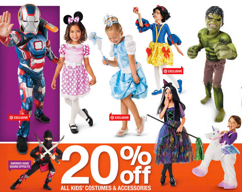
For years male and female halloween costumes have differed in many ways. Many female costumes are sexualized, while this is not often the case with male costumes. Many of these differences also reinforce gender roles. While female costumes for children may not exactly be sexualized, there are many apparent differences in halloween costumes for male and female children.
These differences can even be seen in childrens costumes as the ad to the right shows. The poses are even more important in these ads. The boys are all in poses that would be considered “power poses”. Poses that make them look strong and powerful. Those are not the terms you would use to describe the poses for the girls. They are in poses that make them seem more dainty and “ladylike”. In addition to all of the girls costumes you can seen their faces, but not in the boys costumes. This seems like yet another ploy to show that the girls need to show themselves off while the boys need to show off their strength. All the girls costumes include either dresses or skirts except for one of them.
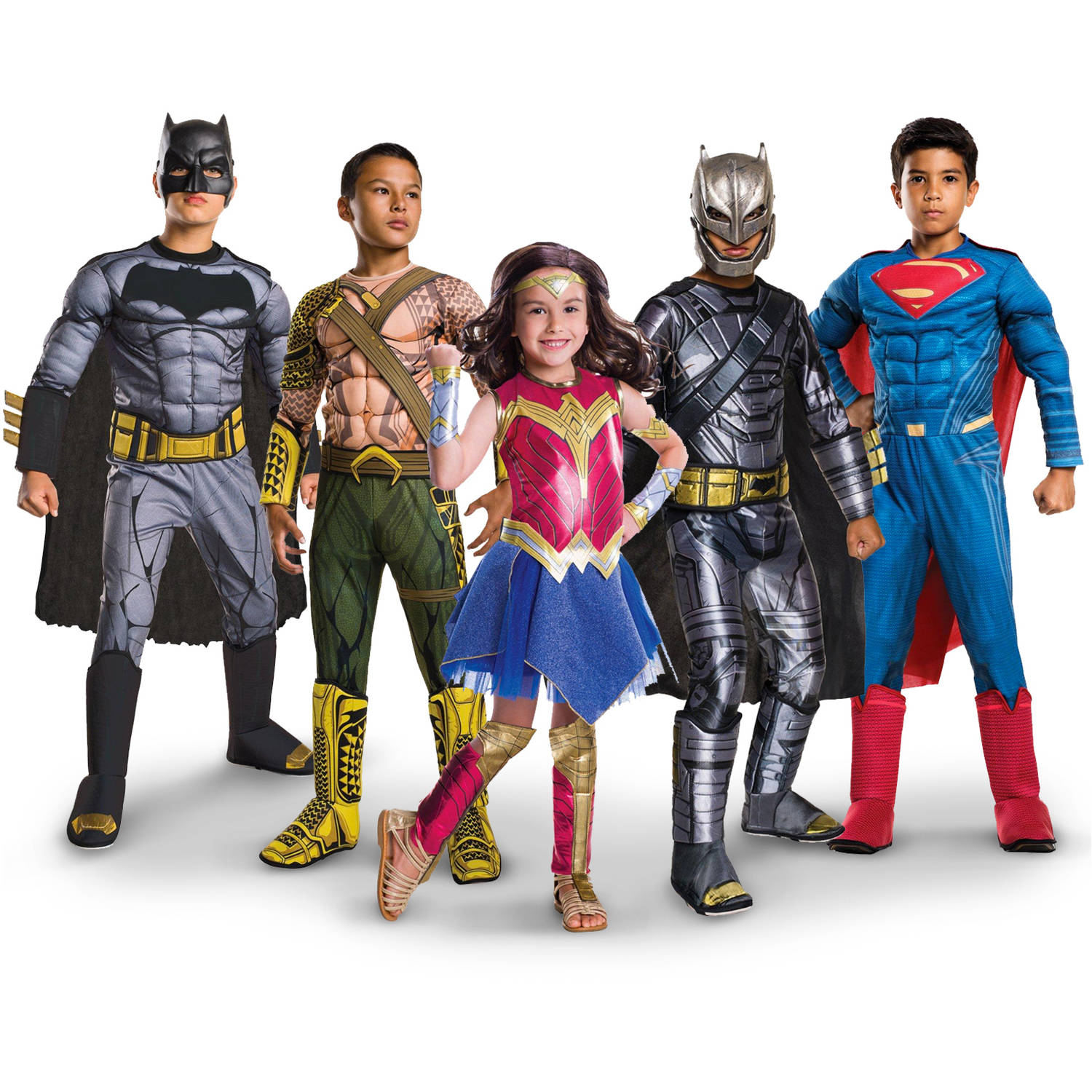
Showing ads like these in magazines leads young girls to feel like they have to dress up like that. It reinforces the idea that they are dressing up to be seen as pretty and cute. This makes it seem like the costumes are more for the pleasure of others rather than the pleasure of those who are wearing the costumes. In the ad below many of the same things are seen. The boys are all standing in poses that make them look strong and powerful. In contrast the girl is posed in a way more similar to the girls in the image above. This ad does however differ from the one above in one way. Rather than being a princess, the girl is dressed as a superhero to go along with the boys. Yet she is still wearing a dress just like the girls in the other ad.
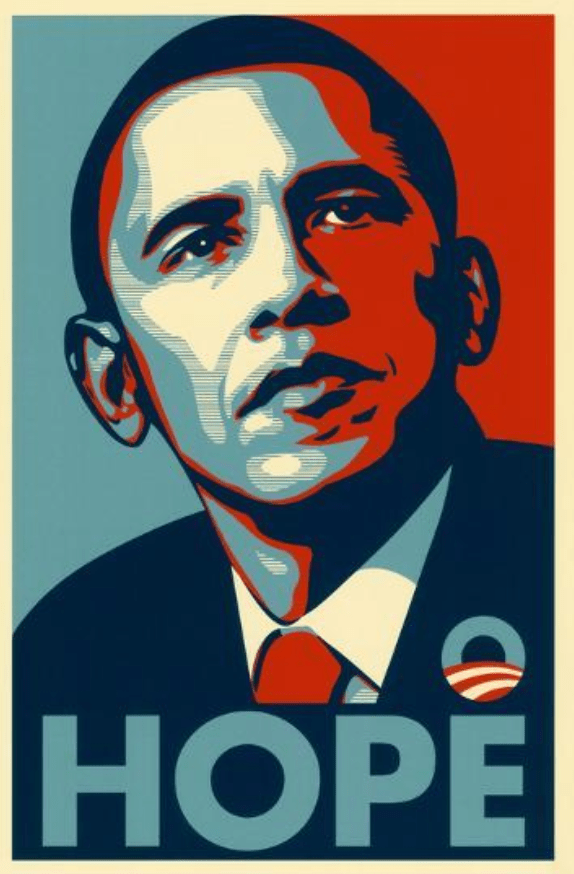
At first glance, there is a lot going on in this image. The fact that it has the word “hope” in big, blue capital letters makes sure the viewer gets the right message that the creators were trying to portray. The man in the picture is our 44th president and our first African American President, Barack Obama. When Obama was running for office in 2008 he included this image in his campaign. Obama is pictured in the “three-quarters view”, meaning he is not turned directly towards the person viewing the image and making eye contact, making him look confident and powerful. At first glance, the bright colors and the contrast makes the image very eye-catching and interesting to look at. But these colors weren’t just chosen to catch someone’s attention, they were chosen meticulously to provide deeper meaning in the image. These colors are obviously the nation’s colors and represent patriotism, but they also represent the combination of democrats and republicans that make up America. In Obama’s eyes, they can coexist and he can be everyone’s present and help accomplish everyone’s goals, not just the democrats. In 2008 only a few days before the primary elections, a lot of the democratic votes were going to Hillary Clinton. It was vital that Obama win over the democrats and the election as well. A very popular and progressive street artist, Shepard Fairey, wanted to help Barack Obama succeed in the upcoming elections. With the approval of campaign managers he created the impactful image below. A lot of the pictures and slogans that candidates use for their political campaigns can be very negative and focus on what America or even specific individuals are doing wrong. For example, Trump’s slogan “Make America Great Again” is very negative. This type of campaigning often makes people react in the opposite way you would want them to. It could anger individuals or drive them away, resulting in less votes for that candidate. On the other hand, Obama’s image is positive. It doesn’t imply anything and it is hopeful. The way he presents his campaign tells a lot about himself, many people often referred to him as America’s most down to earth and sweet president. We are lucky enough to live in a country where there are multiple candidates running for office and we have a say in whether we like them, don’t or are impartial. This freedom of ours leads to candidates having to prove their worth to the country. Through speeches, slogans, posters, facebook videos, etc, candidates have to prove to the American population why we should vote for them. So, naturally, the intended audience for this image is every US citizen. The original picture that Fairey created had the word “PROGRESS” but after some concern with how people would interpret it, it was later changed to “HOPE”. This word can have a lot of different meanings so it opens up the viewers imagination and lets them put their own meaning to it in a way. This image spreads hope for the future, hope for the present and hope that Americans can work together to reach their goals.
For my advertisement, I chose a commercial that involved a school shooting public service announcement. This commercial was created by the parents of the Sandy Hook victims. First off, this commercial portrays a very intense message. During the commercial, it shows several different kids talking about back-to-school items that they got, and how useful the items are in their daily lives. While this goes on, a school shooting begins to develop and the students start using their back-to-school items as defense tools. For example, in one scene, there is a girl who is trying to help her friend survive in the hallway with a sock after she was shot in the leg. I have never seen a commercial with this intense of a story line, and the concept of students even having to think about that truly gave me goosebumps.
It is clear to say that the message this commercial is trying to convey to viewers is to be aware of what’s happening and recognize the signs of a school shooter, as well as the fact that kids in current times have to be conscious about something like this occurring, as it has happened so many times within recent years. Unfortunately, school shootings do still occur much more often than many people realize, and the parents of the Sandy Hook victims are trying to bring awareness to the situation, and work towards putting a deserved end to them. The parents want other students to notice the signs of a student who could potentially be of harm to other students and may even be inclined to cause such destruction as bad as a school shooting. I don’t think the parents could have had a better idea to spread awareness than creating this commercial. As I had mentioned earlier, the serious tone and the sound of the students running and screaming makes the audience truly feel the emotions taking place in the video. Another important element of this video is that you can also hear footsteps in the hallway and faint gunshot sounds in the distant background.
There are only two scenes in the commercial that were not involved in hinting any violence. It was the first and second scene, and it looked like the beginning of the school day. The scene was a student showing his new backpack while looking for books in his locker. The second scene involved another student showing the folders she got that helped her stay organized. These two first scenes are the main reason this commercial tricks a lot of viewers. It makes you initially think that it is just an ordinary back-to-school advertisement, but in fact, it’s much deeper than that.
The majority of the commercial parts consist of showing students how to defend themselves and how to safely escape a building that has been breached. As an example, one of the scenes in the advertisement contained a student that got a skateboard for back-to-school and he was later shown using it to break the window in a classroom so that students could escape the shooter. So, not only is the video made to spread awareness, but it is also created to help students or teachers handle the situation, and know the steps to take in case of an emergency.
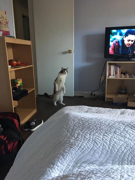
“Who is he? What does he want? Who’s mans is this? What does his heart seek?” These are the first thoughts I had upon seeing the above image. This image filled me with such a feeling of dread and unease that I had to close my laptop, stick it in the fridge, and go cry by the dumpsters outside for an hour and a half.
The most prominent figure in this picture is the diminutive gentleman in the fur coat or “housecat.” He is entering the room as if to query your presence, Stranger, or to let out a tremulous cry of warning. What he is warning, we shall never know for his pronouncement catches in his trachea like an unsuspecting child specimen trapped in an IKEA.
Now one might initially see a cat walking on its hind legs and think, “I might as well lie down and die right now as he is clearly the alpha. He will consume my flesh. These are the end times. Goodnight, sweet prince.”
BUT upon closer examination of his body language, we can conclude that all is not well. His tail is not held with the jaunty swagger usually seen on fluffy cats like this, but it lies low to the ground, with a dip like that in the stock market. His tail hangs behind him like the anchor of an old warship being hauled away for scrap, once a thing of beauty and power but now decrepit and obsolete like so many killing machines of old.
The Presence under your lintel (the top part of a doorframe) holds his forelimbs in suspicion and apprehension. He is betwixt thoughts of sanctuary and thoughts of jeopardy. What does he know that you don’t? Who does he think you are? What does he suspect you of knowing?
Next we come to the Figure’s eyes. Alas, his eyes! Stranger, have you ever seen such eyes? Behind them, distrust, yes, but there is something more, something ancient and noble, illustrious and bold. His visage says run and hide.
Above his eyes, like two soft mountain peaks stand his ears, ever-vigilant. What do they hear? Hear them celestial harmonies of symphonies past, ethereal melodies? Or mayhap he hears the echoes of battle, the distant screams of children, the staccato of gunfire, and the whine of an ersatz Armageddon falling from the heavens. Has he spent his civilian life trying to escape the war or return to it? What does he hear that he longs to forget? What eternal cacophony plays in his head every eve before he plunges into the fathomless depths of slumber?
To understand this image, we must examine the figure in its context. He ambles into a bedroom in a state of moderate disarray. His eyes follow you. You, Stranger, lie upon your bed, engaging in modern media from the blue light box. Why are there maracas on your shelf? What are they for? Do you play the song of the universe to the drumbeat of time, do you play until your lifeforce runs dry and you become another dusty old record on the shelf?
Furthermore, the picture itself must be analyzed, not just the scene of impending chaos within. The colours are muted, there is poor lighting and a graininess to the quality of the photograph. This shows a dissociation between the medium and the message. This was likely taken on a cellular telephone camera, but the Figure asks you, “WHY?” The artist uses an everyday object to capture a rare occurrence. The disconnect between the physical and emotional qualities of the image forces the viewer to realize themselves within the situation. This is representative of the eternal battle between the aesthete and the moralist; the amoral aesthete is a hedonist and the moralist with no aesthetic clings to a puritanical view of opulence, only the appearance of abundance.
But what is this picture trying to tell us? There are many possible interpretations. P’rhaps the pale Figure is meant to be understood as a visual metaphor for Death. Death comes to take us all in the end; maybe he knocks on your door or maybe he creeps in silently. Death rides a pale horse, and can’t you just imagine this cat in lil cowboy boots?
In 1958, Budweiser released an advertisement starring a husband, who seems frustrated with some construction work, and his wife, who is happily pouring him a tall glass of beer (see figure 1). At first glance, the picture seems innocent, but if you break it down you perceive the subliminal message it is sending to its audience.
At the top of the picture sits the Budweiser brand name and below it rests its motto: “Where there’s life… there’s Bud.” Most, if not all advertisements include these critical aspects. Companies want customers to know what their product is and by using a catchy motto, they can easily draw in consumers. However, this motto also suggests more than just a catchy phrase. It states that without Budweiser beer, life simply is not possible. Any task, such as simple construction or maybe even the repair of a phone, cannot be done without enjoying a nice cold Budweiser beer. Putting this thought into customer’s heads makes the thought of purchasing beer far more appealing. Afterall, who would not enjoy a beer while hard at work? Certainly not the man featured in this picture. Before taking a look at the most eye catching part of this advertisement, there is one more important phrase positioned just under the man’s head. This phrase states, “THE KING’S CREDENTIALS: The King of Beers prints its ingredients right on the label. Know of any other beer that does?” Now this is just a straight up power move. Budwesier is asserting its dominance amongst all the different brands of beer. According to Budwesier, no other beer prints its ingredients on the label because only the King of Beers (Budweiser) can do this.
Above The King’s Credentials is the most eye catching portion of this picture. There is a man wearing a red collared shirt and holding a hammer as if he was just working on a project. His expressions seems a little frustrated and reads “oh well.” Behind him is his wife. She is a young blonde woman wearing a light pink sweater. She is smiling happily as she pours her husband a tall glass of Budweiser because she knows this may help him feel better. Or at least that is what the advertisement is trying to portray. Now, the target audience of this ad is not necessarily targeting anyone at random. Infact, it is targeting the female audience in this case. While the man is the main subject of this picture, it is the woman who is bringing the emotion to the ad. During this time it was assumed that a woman’s role in the house was to be the perfect housewife. Budweiser appeals to women by suggesting that if they serve their husbands Budweiser while they’re working it will make her and her husband much happier. You can tell by the face the man is making that even though he is frustrated, he is happier now that his wife has given him. It can also appeal to men, especially those who do not yet have a wife or significant other. This ad suggests that men in “perfect” marriages drink Budweiser which can influence consumer’s purchases even more.
The color of this picture is also important. Imagine this ad containing primarily dark or neutral colors. Instead of a red background and big white letters, pretend the background is white with black letters. This image is far less eye catching when compared to the actual ad. The color red has many significant meanings. It can mean death, blood, strength, or even love. In this case, the color red is used to symbolize the feeling of love the wife feels towards her husband in this ad. This is extremely convenient, not only does red represent love and make the picture pop, but it also is a common theme in the product advertised itself. By overwhelming customer’s senses with the color red, it makes it easier for them to begin associating red with the Budweiser brand. This tactic is basic conditioning and a very useful psychological tactic when one is trying to influence another’s actions. Of course, another visual aspect of this ad that is important is the glass of beer itself. The action of the beer being poured and the way it fizzes makes it seem fresh, refreshing and nearly drinkable off the page. This makes viewers more thirsty and more likely to purchase a pack of Budweiser because everyone knows alcohol is definitely hydrating.
In a photograph posted by the Federal Drug Administration, in “The Real Cost”, a campaign to stop teens from vaping e-cigarettes, triggers an emotional reaction from viewers. The intention of this advertisement is to scare teenagers from engaging in the consumption of the product. This image is effective in targeting this specific audience through 3 things: the textual content, the imagery and the colors.
The text is critical in ensuring a experience of logos, or credibility, in thecommercial. Teenagers are usually rebellious when a person is saying “no”, to a arguable thing like vaping. This text states the obvious, “Vaping can put dangerous chemicals..”. The next phrase gives the FDA credibility by talking about a specific drug in e-cigarettes, diacetyl.
This picture can help teenagers understand that a short-lived buzz has a greater impact on their bodies than they’ll realize. Through the text saying, “the real cost”, young adults are more likely to recognize that their actions have a cost- the irreversible harm carried out to their lungs. By showing the face of the girl using e-cigs, young adults can see the result in their own smoking. It’s apparent that this girl is reasonably young, but her distorted face makes one question what precisely caused it. This feeling of being “buzzed” in no manner compares to the impact of nicotine to the body. The marks on her face appears as if some thingwas crawling through her body. This component of the photograph suggests to the target audience that the chemicals in nicotine are foreign and are not meant to be in your body. The girls expression appears as if she is wants to quit, likely because she is understanding the negative outcomes on her body. If teens can see the bodily harm their bad habits entail, they’re much more likely to stop.
The setting of the photograph is also essential. Most teens using e-cigarettes are doing so without their parents or guardians knowing. This photo takes place in a bathroom. The girl has a backpack on, which contributes to the idea that this may take place in a school. The woman is hiding because she doesn’t want to be caught with this product. The coloring used on this picture also assists in setting a mood for the picture. Overall, dark colors are being used. Dark purple is on the girl’s flannel. This color provoked emotions of sadness. The yellow-green shade on the wall is related sickness and discord. These hues are essential in stirring up emotions that align with the message the FDA is attempting to expose to teenagers.
This picture portrayed e-cigarette use as a risky addiction with long term, health altering effects on teens. The slogan, “The Real Cost”, explains that there’s an underlying value that doesn’t have to do with money. The actual price of using e-cigarettes is the health of it’s users. The FDA is a success in using this advertisement because of their use of text, imagery and the coloring of the advertisement. The text gives details that a ten will not argue with. Their use of precise chemical names shows teens that the issue their use has harmful things in it. The girl within the advertisement’s facial response and physical. capabilities first put young adults in her position because of her age. Next, the harm done to her body by the e-cigarettes warns the viewer of nicotines damage to the body. Finally, the colors used during the photo display exactly the mood the reader was intended to feel. Overall, this photograph did the job of warning young adults to stop using these devices before they pay ‘the real cost’.
The image I have chosen to analyze is a photo of a neighborhood in Queens, New York in December, after the superstorm Hurricane Sandy devastated most of the east coast. The first thing you see when looking at the photo, is an American flag covering a piece of debris while everything else in the background is destroyed by either the hurricane or demolished due to damages that were to sever to repair. Further in the background, the debris and rubble left by Sandy are also surrounded by homes and vehicles of another neighborhood that were fortunate enough to survive the damages and demolition caused by hurricane Sandy. This photo was also used as a header for an article written in 2013 about the politics of disaster aid in America.
The first thing you see when looking at the photo, is an American flag with a few holes in it, hung over a piece of rubble, while the sun still gleaming across its stars and stripes. The flag is in the middle of a whole complex of torn down houses and buildings. These structures were either destroyed during the hurricane or had damages too severe from the hurricane that they had to be torn down and rebuilt later. Even further in the background, more houses and some vehicles surrounded the dilapidated area which were all fortunate enough to survive the damages from the hurricane. The sky was mostly grey with overcast and all the trees didn’t have their leaves, giving the photo a desolate look and desperate feel to it. The photo is primarily for American citizens that have been affected by natural disasters or people concerned about the effects natural disasters can have on our country and families. The audience when looking at the photo might feel a sense of hope seeing the American flag brightly light by the sun surrounded by piles of rubble. This implies that these Americans affected by the damages of the hurricane still has hope that things will get better despite losing their homes and many valuable items
The interesting part about the photo is that it was taken two months after Hurricane Sandy came, meaning that the flag has been sitting there for months untouched. The reason why the flag was placed in a disgusting and destroyed location rather than on a pole somewhere nicer, is to show that even after disaster strikes, America still stands strong along with all of its people. America has experienced many disasters throughout the years, from category 5 Hurricanes, 9.2 magnitude earthquakes, and thousands of tornados. In 2018 there were over 100 natural disasters that hit America killing over 350 Americans causing $82 billion in damages. Yet after so much loss and worry caused by these natural disasters, Americans affected by these disasters and even ones that were not, still shows support and hope for their country. Even though there are hundreds of natural disasters that destroy homes, buildings, and families; everybody gets through it and recovers in the end. No matter what happens, it’s always to remember that things will get better and to still hold hope, and that’s what this photo is trying to say.


You must be logged in to post a comment.